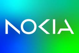

A new era for Nokia, a Finnish multinational telecommunications firm, has begun.
In a Facebook post on Sunday, February 26, Nokia revealed its brand-new logo as part of its first rebranding effort in 60 years.
"This is Nokia, but not as the world has seen us before. Our new brand signals who Nokia is today. We're unleashing the exponential potential of networks and their power to help reshape the way we all live and work," it captioned the post.
The ravamped logo is no longer plain white and blue, but is now a gradient of green and blue.
In a separate press statement, Nokia said it first unveiled its logo along with its new strategic pillars during the 2023 Mobile World Congress (MWC) held in Barcelona.
"We see the potential of digital to transform business, industry, and society, with an opportunity for significant gains in productivity, sustainability, and accessibility. Our market-leading critical networking technology is increasingly needed by customers and partners in every industry. We see a future where networks go beyond connecting people and things," CEO and President of Nokia Pekka Lundmark said.
Meanwhile, in an interview with media company Bloomberg, Laudmark said the revamp of the logo also serves as a reminder to the world that Nokia is no longer a mobile phone brand.
The telco firm has stopped making mobile phones since it sold its mobile and devices division to Microsoft Corp. in 2014.
"We want to launch a new brand that is focusing very much on networks and industrial digitalization, which is a completely different thing from the legacy mobile phones," he noted.
